Overview
Contribution
Lead Product Designer (UX/UI Design) / Animator
Team
Dr. Maunank Shah
Sebastian Seiguer
Morad Elmi
Pau Varela
Direct Observed Therapy (DOT) is currently the standard of care for tuberculosis (TB) treatment. A healthcare worker is required to watch and confirm that tuberculosis patients take their medication, either at the clinic or at the patient's home. This is to prevent the development of Multi-Drug Resistant TB strains, and to completely eradicate the disease while it is treatable.
The project has a simple solution: use the camera on mobile phones to record a video of patients taking medication, and upload to a secure server for the healthcare worker to watch on his/her own time. Dr. Maunank Shah, a leading infectious disease expert, provided the research and user-testing necessary to make miDOT a feasible reality. This project took miDOT from prototype to product.
miDOT is currently being used by various health departments in Maryland, Texas, and California with ongoing negotiations for international implementation.
Research + definition
Tuberculosis treatment requires Direct-Observed Therapy (DOT), but it is costly, inefficient, and cumbersome.
We conducted research interviews with Dr. Maunauk Shah and his team at Johns Hopkins Hospital. Their insight provided detailed information on the specific obstacles to treat tuberculosis.
- Time, effort, and expenses of healthcare workers and patients are strained due to DOT requirements.
- Tuberculosis patients have difficulty adhering to medication therapy that lasts a minimum of 6 months. Multi-drug resistant TB requires therapy that lasts approximately 2 years.
miDOT consisted of two main interactions-- one for the patient on mobile phone, and the other for the physicians on desktop computers. The tool was meant to be used as a way to build on the existing personal connection between patients and healthcare workers.
UX Design
How to arrange big data on an interface that is easy to understand and easy to navigate?
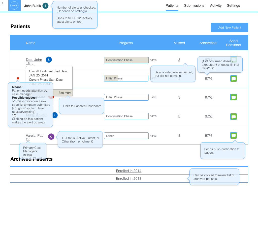
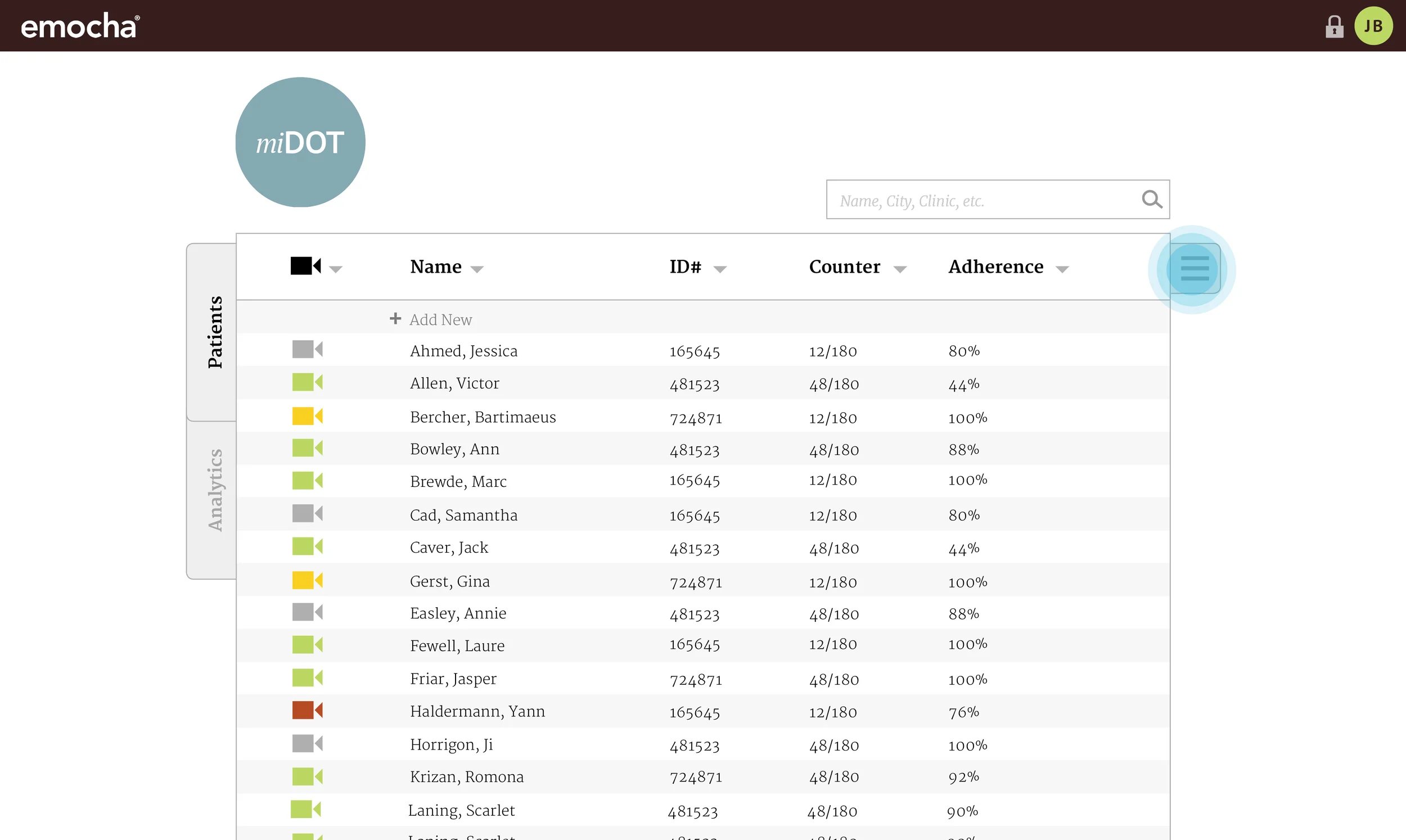
We began by determining the most commonly used modules for individual patients and designing key interactions between the healthcare worker and the patient. This was then followed by the overall patient-listing and general interactions that the healthcare worker would experience on a day-to-day basis.
After working out initial wireframes and interaction flows on the whiteboard, we tested prototypes with users.
App


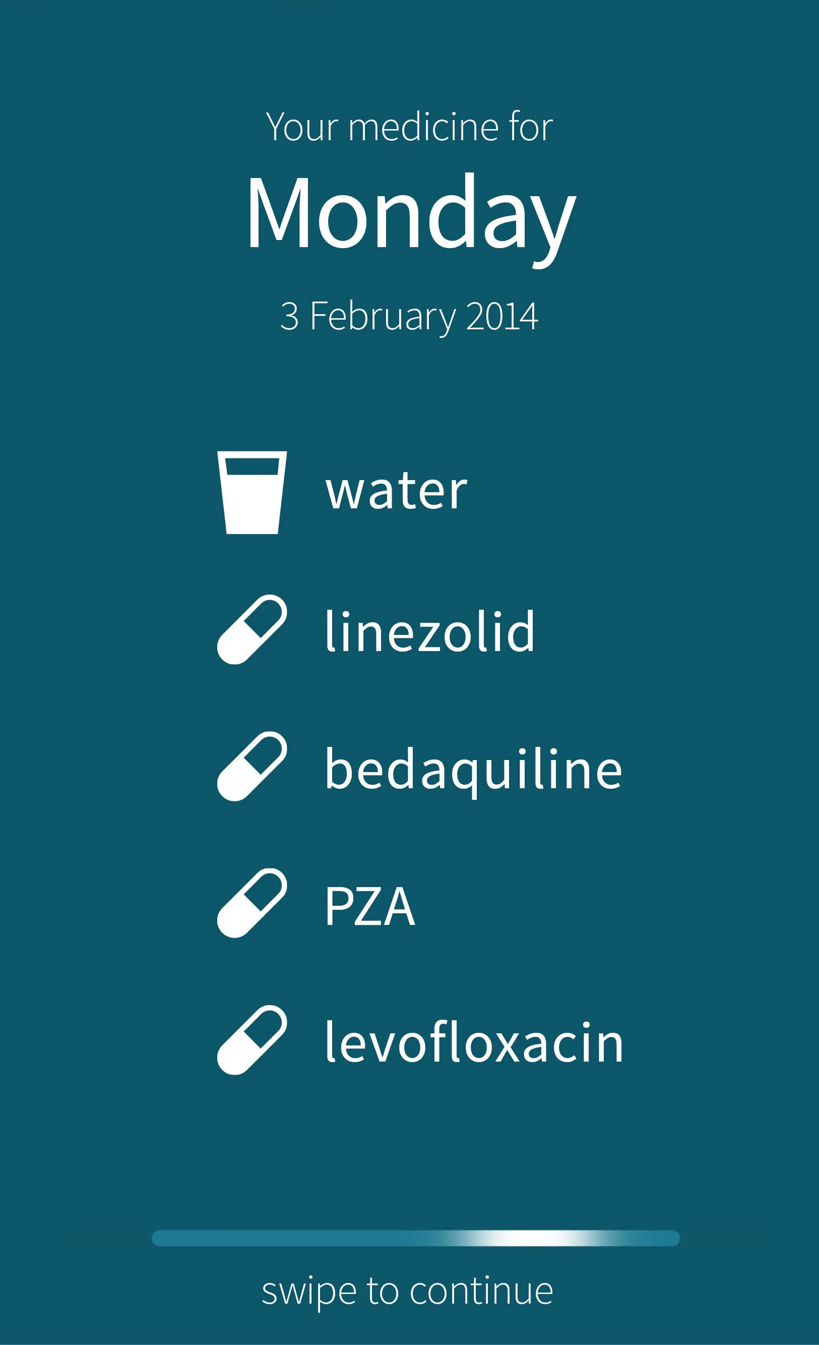
The final workflow followed a simple pattern. Since tuberculosis patients often take medication daily, it was crucial that the process of recording symptoms and uploading video was as streamlined as possible.
App workflow
Desktop
We conducted white-board sessions with Dr. Shah and clinic visitations to understand what physicians needed to see on the desktop. The workflows and interface structure was informed by observations of patient/physician interactions and current DOT care procedures.
Initial desktop wireframes were created and user-tested to show proof of concept. We also began to explore ways that miDOT could be used with a larger user base and monitor trends for better patient outcomes.


Once we built a functioning prototype and started testing it successfully with a small group of users, we started to build on the desktop interface functionality.
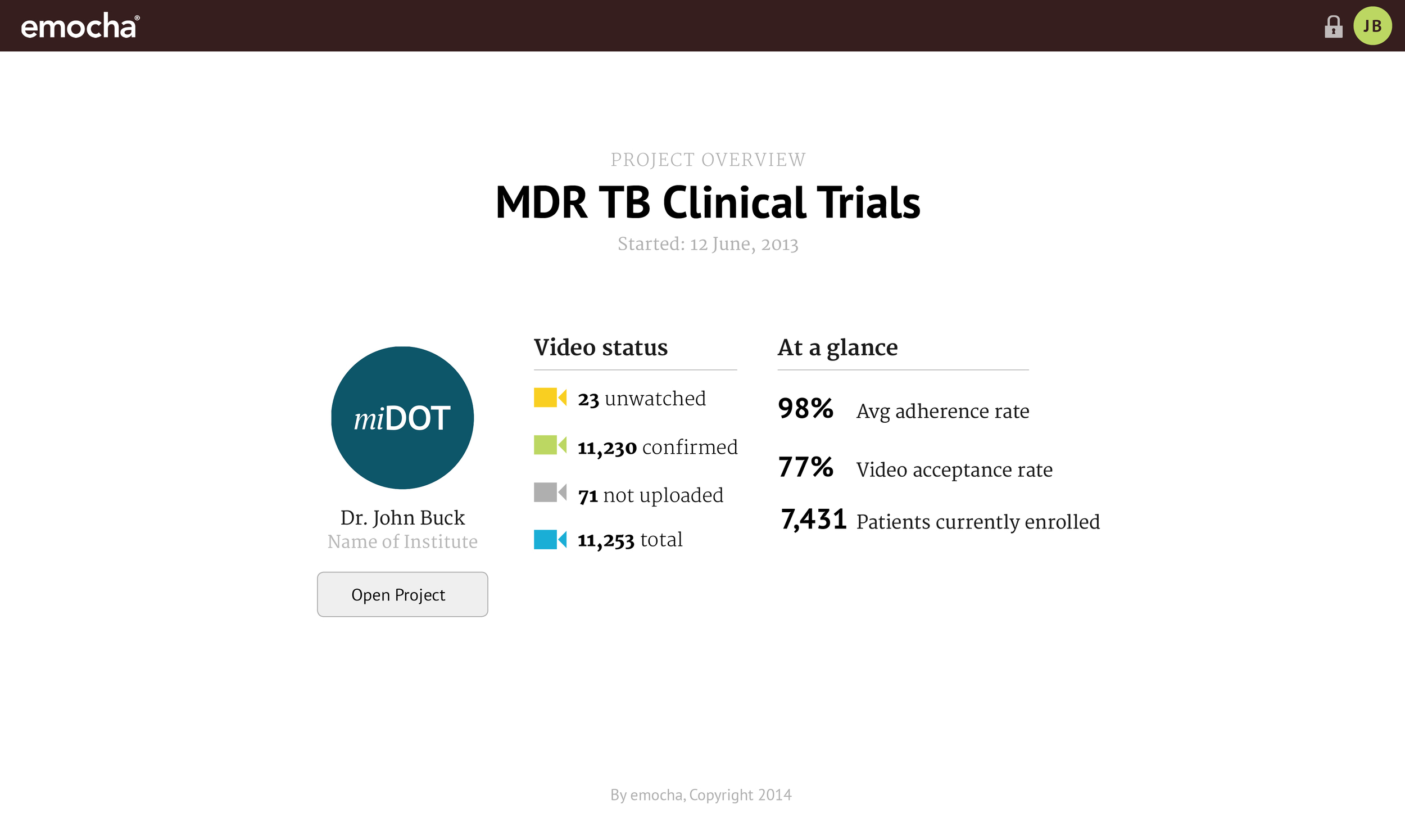
Our mockups were much more robust than we could build at the time, but designing a comprehensive web application with Dr. Shah allowed us to gain much more knowledge about what could really help clinicians keep track of patients. The desktop interface designs eventually resembled electronic medical records for tuberculosis patients that could also be used for other infectious disease management.

